
Executive Development Programme in Responsive Design and Mobile First
This programme equips executives with skills in responsive design and mobile-first strategies, enhancing digital strategy and user experience outcomes.
Executive Development Programme in Responsive Design and Mobile First
Programme Overview
The Executive Development Programme in Responsive Design and Mobile First is designed for senior-level professionals, digital strategists, and designers who are committed to enhancing their expertise in developing user-centric, responsive web experiences. This comprehensive program equips participants with the latest methodologies and tools to create mobile-first strategies that seamlessly adapt to various devices and screen sizes. Through hands-on workshops, case studies, and collaborative projects, learners will delve into the intricacies of responsive design principles, including fluid grids, flexible images, and media queries, as well as the importance of accessibility and user experience design.
Participants will develop key skills in front-end development frameworks, such as CSS Grid and Flexbox, and learn to leverage modern design systems and responsive design techniques to optimize digital experiences. The curriculum also covers the integration of progressive web app (PWA) technologies, which enhance offline capabilities and improve user engagement. By the end of the program, learners will be proficient in implementing responsive design practices that drive business growth and customer satisfaction.
The career impact of this program is significant, as it prepares executives to lead strategic initiatives that ensure digital products and services are accessible and engaging across all devices. Graduates will be well-equipped to influence digital strategy, optimize user engagement, and drive innovation in their organizations, ultimately contributing to higher conversion rates, improved user satisfaction, and enhanced brand reputation.
What You'll Learn
Embark on a transformative journey with our 'Executive Development Programme in Responsive Design and Mobile First.' Tailored for executives and professionals seeking to lead digital strategy in the modern landscape, this programme equips you with the latest tools and techniques in responsive design and mobile-first development. Delivered by industry experts, the curriculum covers essential topics such as user experience (UX) design principles, adaptive layouts, and the impact of mobile interfaces on user engagement. Participants will engage in hands-on projects, including wireframing, prototyping, and testing responsive designs, ensuring practical application of knowledge.
Upon completion, graduates will be adept at optimizing digital products for diverse devices, enhancing user experience, and driving business outcomes through strategic design. The programme also provides insights into emerging trends and best practices, preparing you to lead innovation in your organization. Graduates can pursue advanced roles in UX design, product management, and digital strategy. By leveraging the skills acquired, you will be instrumental in shaping the digital future, ensuring your organization remains competitive and connected in an ever-evolving landscape.
Programme Highlights
Industry-Aligned Curriculum
Developed with industry leaders for job-ready skills valued by employers worldwide.
Globally Recognised Certificate
Recognised by employers across 180+ countries as a mark of professional excellence.
Flexible Online Learning
Study at your own pace with lifetime access to all course materials and updates.
Instant Access
Start learning immediately — no application process or waiting period required.
Constantly Updated Content
Stay ahead with the latest industry trends, best practices, and emerging insights.
Career Advancement
87% of graduates report measurable career progression within 6 months of completion.
Topics Covered
- 1. Introduction to Responsive Design Principles: Learners will study the basic principles of responsive design, including fluid grids, flexible images, and media queries. They will gain foundational skills in creating layout adaptable to various screen sizes.
- 2. Mobile First Design Thinking: This module covers the philosophy of mobile first design and how to apply it in creating user-friendly interfaces. Learners will learn to prioritize mobile design and then scale up to larger screens.
- 3. CSS Media Queries and Responsive Layouts: Learners will explore the use of CSS media queries and techniques for creating responsive layouts. They will gain hands-on experience in crafting responsive designs that adapt to different devices and screen sizes.
- 4. Flexbox and Grid for Responsive Layouts: This module delves into the use of Flexbox and Grid layouts for responsive design. Learners will master the creation of flexible and adaptive layouts that respond to user interactions and screen size changes.
- 5. Advanced Techniques in Responsive Images: Learners will study advanced techniques for handling responsive images, including responsive image sources, lazy loading, and image optimization strategies. They will learn how to deliver the best user experience with the least impact on performance.
- 6. Cross-Browser and Cross-Device Testing: This module focuses on testing responsive designs across multiple browsers and devices. Learners will learn best practices for ensuring consistency and functionality across different platforms.
- 7. Performance Optimization for Responsive Websites: Learners will study techniques for optimizing the performance of responsive websites, including image compression, minification, and caching strategies. They will gain skills in delivering fast-loading, responsive websites.
- 8. Accessibility in Responsive Design: This module covers the importance of accessibility in responsive design and how to implement accessible design practices. Learners will learn to create designs that are inclusive and usable by all users, regardless of their abilities.
- 9. Case Studies and Real-World Applications: Learners will analyze case studies of successful responsive designs. They will gain insights into real-world applications and best practices for implementing responsive design in various industries and contexts.
- 10. Future Trends in Responsive Design: This module explores emerging trends and technologies in responsive design, including adaptive design, progressive enhancement, and responsive web fonts. Learners will gain a forward-looking perspective on the future of responsive design.
What You Get When You Enroll
Secure checkout • Instant access • Certificate included
Key Facts
Audience: Web developers, UX designers
Prerequisites: Basic HTML, CSS knowledge
Outcomes: Master responsive design principles, implement mobile-first strategies
Ready to get started?
Join thousands of professionals who already took the next step. Enroll now and get instant access.
Enroll Now — $199Why This Course
Enhance Career Relevance: The 'Executive Development Programme in Responsive Design and Mobile First' equips professionals with the latest skills in web and app development. This is crucial as over % of web traffic now comes from mobile devices, making mobile optimization a top priority for businesses. By mastering these skills, professionals can better meet the demands of their industry, enhancing their employability and career advancement opportunities.
Boost Problem-Solving Skills: The program focuses on teaching responsive design principles, enabling professionals to create user-friendly interfaces that adapt seamlessly to various devices. This not only improves user experience but also hones critical thinking and problem-solving abilities, which are valuable in any professional setting.
Leverage Market Demand: With the increasing shift towards digital engagement, companies are seeking professionals who can implement mobile-first strategies. This program prepares individuals to lead or contribute effectively in projects that require a mobile-first approach, aligning their skill set with market trends and increasing their value in the job market.
Develop Strategic Insights: The curriculum includes strategic planning elements that help professionals understand how to design for different devices and user needs. This strategic thinking can be applied across various business functions, from marketing to product development, thereby broadening the scope of their professional impact.
Your Path to Certification
Trusted by Professionals Worldwide
Course Brochure
Download our comprehensive course brochure with all details
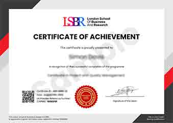
Sample Certificate
Preview the certificate you'll receive upon successful completion of this program.
Get Free Course Info
Enter your details and we'll send you a comprehensive course information pack straight to your inbox.
Employer Sponsored Training
Let your employer invest in your professional development. Request a corporate invoice and get your training funded.
Request Corporate InvoiceWhat People Say About Us
Hear from our students about their experience with the Executive Development Programme in Responsive Design and Mobile First at LSBRX - Executive Education.
Oliver Davies
United Kingdom"The course content was incredibly comprehensive, covering everything from the basics of responsive design to advanced mobile-first strategies, which significantly enhanced my practical skills in creating user-friendly mobile applications. I've already seen career benefits, as my recent project at work was praised for its seamless mobile experience, thanks to the techniques I learned in the program."
Hans Weber
Germany"The Executive Development Programme in Responsive Design and Mobile First has significantly enhanced my ability to create user-friendly, visually appealing websites that perform well across various devices. This skill set has opened up new opportunities in my career, allowing me to take on more challenging projects and contribute more effectively to my team."
Kavya Reddy
India"The course structure was well-organized, providing a clear progression from foundational concepts to advanced techniques in responsive design and mobile-first approaches, which greatly enhanced my understanding and practical skills. The comprehensive content and real-world applications have been invaluable for my professional growth, equipping me with the tools to tackle complex design challenges effectively."