
Executive Development Programme in Responsive Design for Mobile Devices
This programme equips executives with the skills to design responsive websites and apps, enhancing user experience across mobile devices.
Executive Development Programme in Responsive Design for Mobile Devices
Programme Overview
The Executive Development Programme in Responsive Design for Mobile Devices is a specialized course tailored for executives, designers, and technical leaders aiming to enhance their strategic and technical understanding of mobile design principles. This program is designed to equip participants with the knowledge and skills necessary to create user-friendly, responsive designs that optimize user experience across various devices and screen sizes. Participants will delve into the latest trends, tools, and methodologies in mobile design, including adaptive layouts, fluid grids, and content prioritization techniques.
Key skills and knowledge developed through this programme include a deep understanding of responsive design principles, proficiency in using modern design tools, and the ability to implement design systems that are scalable and adaptable to different platforms. Learners will also gain insights into the business implications of mobile design choices, such as user engagement, conversion rates, and brand perception. By mastering these competencies, participants will be well-prepared to lead or contribute to design initiatives that drive business success in the mobile-first era.
The programme has a direct and significant impact on participants’ careers, enabling them to lead more effective product development strategies and enhance their organization’s digital presence. Graduates of this programme will be better equipped to make informed decisions that prioritize user experience and technical efficiency, contributing to the overall success and competitiveness of their organizations in the global market.
What You'll Learn
The Executive Development Programme in Responsive Design for Mobile Devices is a comprehensive, week course designed to empower leaders and professionals in the tech industry with cutting-edge skills in responsive design. This program is invaluable for those aiming to enhance user experience across various devices and platforms. It covers essential topics such as HTML5, CSS3, JavaScript, and frameworks like React and Angular, ensuring that participants gain a deep understanding of responsive design principles and best practices.
Participants will learn how to develop intuitive interfaces that adapt seamlessly to different screen sizes and devices, improving user engagement and reducing bounce rates. By the end of the program, graduates will have the skills to lead projects from concept to completion, ensuring that digital products meet the highest standards of usability and accessibility.
This program opens doors to a wide array of career opportunities, including roles as a responsive design lead, UX/UI designer, or senior developer. Graduates are well-prepared to contribute to a company’s digital strategy, enhancing its online presence and user experience. With a focus on practical, hands-on learning, participants will not only gain theoretical knowledge but also the confidence to implement responsive design solutions in real-world scenarios.
Programme Highlights
Industry-Aligned Curriculum
Developed with industry leaders for job-ready skills valued by employers worldwide.
Globally Recognised Certificate
Recognised by employers across 180+ countries as a mark of professional excellence.
Flexible Online Learning
Study at your own pace with lifetime access to all course materials and updates.
Instant Access
Start learning immediately — no application process or waiting period required.
Constantly Updated Content
Stay ahead with the latest industry trends, best practices, and emerging insights.
Career Advancement
87% of graduates report measurable career progression within 6 months of completion.
Topics Covered
- 1. Introduction to Responsive Design: Learners will study the basic principles of responsive design and its importance in creating mobile-friendly websites. They will gain foundational knowledge on how to adapt designs to different screen sizes.
- 2. Understanding Mobile User Experience (UX): This module focuses on the principles of mobile UX design, including user behavior, interaction patterns, and accessibility. Learners will learn to create user-friendly interfaces for mobile devices.
- 3. HTML and CSS for Responsive Web Design: Learners will explore HTML5 and CSS3 techniques specifically tailored for responsive web design. They will gain practical skills in using media queries, flexbox, and grid layouts.
- 4. Frameworks and Libraries for Responsive Design: This module introduces popular front-end frameworks and libraries such as Bootstrap and Foundation, and teaches how to leverage them to speed up development and ensure responsiveness.
- 5. Adaptive Images and Content Management: Learners will study techniques for managing images and content that adapt to different screen sizes and resolutions. They will learn to optimize images and content for performance and visual quality.
- 6. Testing and Debugging Responsive Websites: This module covers methods for testing responsive designs across various devices and browsers. Learners will learn to identify and resolve common issues in responsive design.
- 7. Performance Optimization for Mobile Devices: Learners will delve into strategies for optimizing website performance on mobile devices, including minimizing file sizes, reducing server response time, and leveraging caching.
- 8. Advanced CSS Techniques for Responsive Design: This module explores advanced CSS techniques such as custom properties, calc(), and viewport units. Learners will gain skills in writing efficient and flexible CSS for responsive layouts.
- 9. Mobile App Design Principles: Learners will study the unique aspects of mobile app design, including interface design, navigation, and interaction design. They will learn best practices for creating engaging mobile applications.
- 10. Case Studies and Practical Projects: In this final module, learners will analyze real-world case studies and undertake practical projects to apply their responsive design skills. They will gain hands-on experience in solving complex design challenges faced in the industry.
What You Get When You Enroll
Secure checkout • Instant access • Certificate included
Key Facts
Audience: Web developers, UX designers
Prerequisites: Basic HTML, CSS knowledge
Outcomes: Master responsive design, enhance mobile usability
Ready to get started?
Join thousands of professionals who already took the next step. Enroll now and get instant access.
Enroll Now — $199Why This Course
Enhance Career Flexibility: The demand for responsive design professionals is rapidly growing as more businesses adapt to mobile-first strategies. Participating in an Executive Development Programme in Responsive Design for Mobile Devices can significantly boost career prospects by equipping you with the latest tools and techniques, making you a valuable asset in any digital team.
Boost Technical Skills: The programme focuses on advanced topics such as front-end development, user experience (UX) design, and cross-platform development. These skills are crucial for developing websites and applications that function seamlessly across various devices and screen sizes, enhancing your technical proficiency.
Career Advancement Opportunities: By mastering responsive design, you can position yourself for more advanced roles, such as a UX/UI designer or a mobile application developer. The programme provides practical insights and case studies that can help you understand how to apply these skills effectively in real-world scenarios, paving the way for career advancement.
Networking and Collaboration: The programme offers an opportunity to connect with industry leaders, peers, and potential employers through workshops, seminars, and networking events. These connections can lead to mentorship, job opportunities, and collaborative projects, further enhancing your professional network and career growth.
Your Path to Certification
Trusted by Professionals Worldwide
Course Brochure
Download our comprehensive course brochure with all details
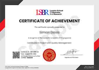
Sample Certificate
Preview the certificate you'll receive upon successful completion of this program.
Get Free Course Info
Enter your details and we'll send you a comprehensive course information pack straight to your inbox.
Employer Sponsored Training
Let your employer invest in your professional development. Request a corporate invoice and get your training funded.
Request Corporate InvoiceWhat People Say About Us
Hear from our students about their experience with the Executive Development Programme in Responsive Design for Mobile Devices at LSBRX - Executive Education.
Oliver Davies
United Kingdom"The course content was top-notch, providing deep insights into responsive design that significantly enhanced my ability to create user-friendly mobile applications. I gained practical skills that have already improved my projects and opened new career opportunities in the tech industry."
Zoe Williams
Australia"The Executive Development Programme in Responsive Design for Mobile Devices has significantly enhanced my ability to create user-friendly interfaces that adapt seamlessly across various devices. This skill has not only made me more competitive in the job market but has also opened up new opportunities for me to take on more challenging projects at my current role."
Siti Abdullah
Malaysia"The course structure was meticulously organized, making it easy to follow and ensuring a smooth learning curve. The comprehensive content not only provided a solid theoretical foundation but also showcased numerous real-world applications, which significantly enhanced my understanding and practical skills in responsive design for mobile devices."